
 Contact us


Nowadays, you can check your emails almost anywhere. It’s no longer necessary to sit behind a computer in a building with a network cable you can plugged in. With significant improvements in mobile devices, increasing wi-fi accessibility, and decreasing costs of mobile data, almost everyone is mobile enabled. Our lifestyle is changing and often, we do work-related stuff on the train, bus, or aeroplane – read and write e-mails, post on social media, make decisions. Therefore, we need to have data available, too!

Qlik Sense has been on its mobile journey for quite some time already. When you open a Qlik app via the browser, its content is automatically reorganized, making selections is optimized for mobile devices, etc. Also, Qlik mobile app is available. And since Inphinity Suite is nothing less than a set of Qlik-native extensions for your Qlik apps, you can use all of them wherever you need, too!
Of course there is a big difference between something being supported and a great user experience. Let me share some Qlik as well as Inphinity related tips, tricks & best practices to help you reach your goals 😊.
THE MAIN DIFFERENCES
A big difference in screen size is quite obvious. Having the Qlik sheet smaller would make all the charts unusable without zooming in. And with zooming, there are problems (or at least inefficiencies). To zoom in, you should know the specific point or area that you’re focused on. Otherwise, you can easily get lost when zoomed in, and keep moving from right to left and back. Therefore, reorganizing and optimizing objects on a Qlik sheet on small displays is a smart move…. if the developer knows what to expect!
This is not what you want to see when looking for insights via mobile phone (it’s my app so no one else is to blame 😋).

Let’s try it now. Open a random Qlik app. If you’re on the computer, open it in a browser. Press F12. In the right menu, there is a button named Toggle device toolbar.
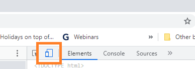
By clicking on it, you can switch between views. If we want to be more specific, in the menu you can select from many options simulating different devices. Does the Qlik app make sense? If yes, try another one… And if this one is usable for mobile devices, too, please send me developers’ contacts so I can congratulate them on a job well done! 😊
Orientation. Horizontal vs. vertical is a tricky one. You can’t say that everyone using a Qlik app on a mobile phone does it vertically (scrolling down & up) and on a tablet works with it horizontally (scrolling right & left). Yes, it is expected, but to master user experience, we need to understand the use case as well as users’ behavior. And sometimes, change the behavior by explaining how a particular approach helps them save time or minimize errors.

SMALL BUT IMPORTANT DETAILS
When I put together the visual concept of actions in Inphinity Flow, I realized how important small details can be. We needed to let users know whether there is any action linked to the icon (so they can click on it) or not. In a few minutes, I had a solution. Visual change when hovering your mouse over it. But… ouch… on mobile devices, there is no hovering your mouse over something. And that was quite a big challenge we solved together with the team, and I’ll be honest, it took us some time.
Another thing that drives many people crazy (me included), is when scrolling through a page becomes zooming in on an object (most often maps) without me wanting it. I just want to keep going down!!!
Qlik itself introduced Gesture-based Touch UI, built for touch interaction in addition to mouse and keyboard use. It supports advanced gestures – tap, hold-tap, swipe, pinch, and lasso. Small details can be very important.
HOW DOES IT WORK IN QLIK?
On small screens, the default responsive design mode automatically displays a sheet as a list view that’s optimized – objects are reordered and resized.
Objects in the list view are ordered based on their upper left corners – from left to the right and top to bottom. Therefore, if you have more filters as standalone objects below each other, on a small screen they won’t be grouped. You will find them scattered among other objects when scrolling down.

For this particular issue, there are two suggested options – use only one filter object with more dimensions or place standalone filters near each other horizontally. As you can see, with all the objects and their combinations, one needs to be thoughtful when designing the app for all screen sizes.

Another thing you should be aware of when designing apps for mobile devices is that objects are not only reorganized but resized, too. A small informative image can be transformed into a giant image without any value.

The reason is that in the list (default) view, the object is stretched to width and except for filters and pure texts, its height is greater or equal to the width. So, even if the object is not squared on the large screen, it is on a small one. See below:

WHAT TO DO?
Understanding the technology is a great way to master it! And since we’re moving to the tips, tricks & suggestions and those are mostly for developers, I will make it easy to read – here is the structured list 😁:
Qlik Sense:
-
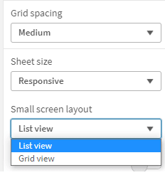
SMALL SCREEN LAYOUT OPTION
In the properties panel of the sheet, you can find the Small screen layout option. By default, it’s a List view (objects are resized and reorganized as explained above). Another option is to use the Grid view option that will minimize the screen. It can be pretty handy but be careful there – it does work with only a few objects on the sheet. Therefore, test the app properly before putting it in production.
-
CONSUME – ANALYZE – ADD – ACT
Objects order is very important, especially on mobile devices with Small screen layout: List view. The user sees one object only most of the time. Therefore we should provide him/her with all the important information first before analyzing the data. Additional information could be shown later or available after action (redirect to another sheet or clicking on the button). With all the information, actions can be done.
-
MINIMUM WORDS
One becomes a copywriter designing apps for mobile devices. 😄 However, on a small screen, every single pixel is important. And sometimes the long text just isn’t shown to a user at all.
-
APP NAVIGATION (INTRO SHEET)
To minimize the time needed for an app exploration, provide your users the first introduction sheet containing the overview of an app. If it includes the interactive buttons to be redirected into a specific sheet or to show a particular KPI, even better. If you like the idea, I recommend the blog post: 9 Tips On How To Introduce Apps To Users.
-
TITLES & FOOTNOTES INSTEAD OF TEXT OBJECTS
If the explanation is in an additional object, due to reorganization on the screen it might follow after the visualization itself. Titles, subtitles & footnotes always stick with the object.
-
EMOJIS RULE! 😎
Use emojis within the KPIs instead of standalone image objects. They’ll stick with the number and in a reasonable size.
-
DETAILS ON-DEMAND: SHOW ONLY WHAT’S NECESSARY
For this purpose you can use conditional showing of objects and fields, container object, or a sequence of pop-up visualizations within Inphinity Flow.
-
LINKED KPIS? VISUALIZE IT!
When KPIs are reordered on the small screens, any invisible visual links between them are lost (e.g. they are next to each other on the big screen). Visualize the relations!
Inphinity Forms:
Inphinity Flow:
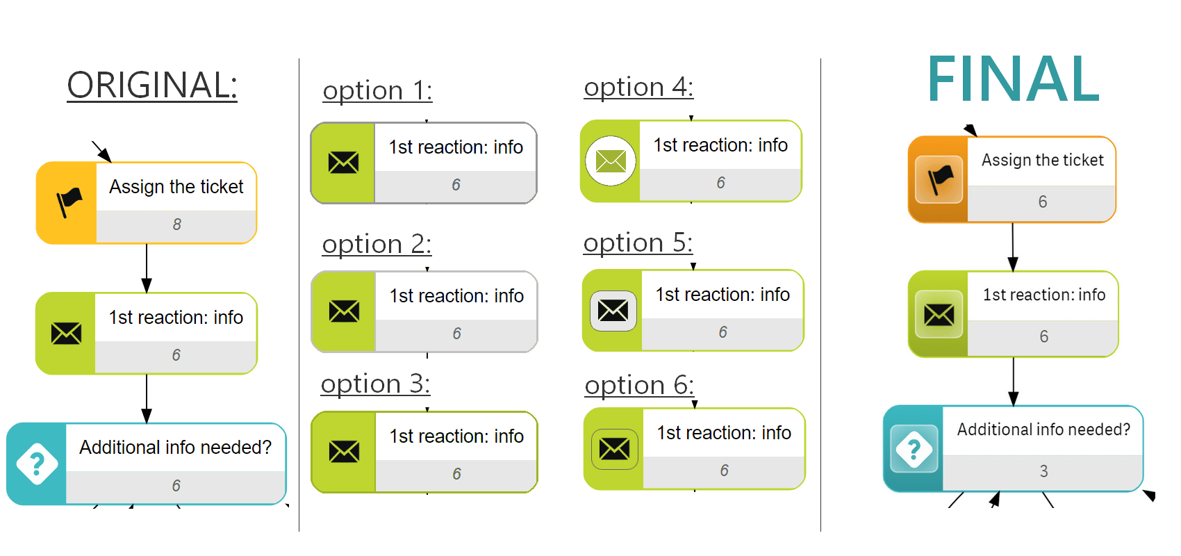
EXAMPLE: SUPPORT TICKET DEMO
Let’s optimize the sheet from our free demo, Support Tickets. Assume we want to use the Small screen layout = List view.

Starting with the most obvious thing, I need to reorder objects so 3 buttons aren’t the first thing the user sees. Let’s start with information that needs to be consumed (the most important KPIs, bar chart where they’re split to customers and priorities) before the user dives into interactive analytics (e.g. filters, charts you want users to make selections, simulations).

Another thing that wasn’t optimized for mobile devices was the buttons for switching between different views (Full process, Current stage, Penalties). They were too big on the mobile screen (resized) and when clicking on them, you don’t see the process itself. Therefore, I decided to use a container object instead (technically: 3 master visualizations instead of one changed according to the variable value). Firstly, I used buttons because of the action clear selections. Unfortunately, this can’t be done in the container object. Therefore, one can redo the data model a bit, or (if it’s just a demo app) you can write it in the subtitle as information.

Additional information shouldn’t cover most of the sheet and defocus users. Therefore, it can be available on another sheet, or shown after clicking a button. I decided to use Inphinity Flow as a button(s) to open a master visualization with detailed information if needed. Its advantage is custom design as well the option to have more buttons in one object 😉.

And here is the Inphinity Forms extension. I used Forms General (table overview) since it’s a table overview and tool for updating the data at the same time. It would still be good if used on tablets horizontally. However, on smaller and vertical screens it isn’t very user friendly. So, what are my options?
- I can let it be as it is and collect the feedback (based on the data about used devices and/or ask users)
- I can switch to Forms Single Record and collect the feedback (based on the data about used devices and/or ask users)
- I can let users decide directly in the app and collect the feedback 😋 (based on the data from monitoring apps and/or ask users)
As you can see, whatever we decide to do, it’s important to collect feedback from users. It’s an application for them and if there are any options they don’t like or don’t use at all, we should remove/change them.
Since you can always find Inphinity Forms General on the first sheet, here I used the Single Record one as an example (with a minimum of buttons and without button labels).
Additionally, I did the copywriting moved all texts related to the objects into the objects themselves (subtitle/footer). In the original version, you could find one note at the bottom of the sheet, that wasn’t anywhere near the object it was about on the mobile screen.
…and who knows… In the end, you might like the new simplistic design much more for the big screens, too 😉.
VIDEO SUMMARY
FREE TEMPLATES
OK, this isn’t new… However, it can be very helpful so let me remind you that on Inphinity Universe, our online demo portal, you can find about 30 Qlik applications showcasing Inphinity Suite for many different use cases (HR planning, document approvals, surveys…) and industries (healthcare, manufacturing, retail…). Most of them are available for download, so you can get them up and running in your own environment and see how it works behind the scenes. Get inspired this summer on our Inphinity Universe.

If you want to get technically inspired watch the TechTuesday video series.
Follow us on LinkedIn to not miss any news from the Inphinity data analytics world!
Enjoy Inphinity Suite 😉!